Get your free demo
{rsform 34March 12, 2025
From the idea to the finished SAP Fiori app (Part 1: Conception)
How to use the SAP S/4HANA Web UI Kit for Figma
In my current project, I visualized a UI card for visitor registration with the prototyping tool Figma. The SAP Fiori Web UI Kit in Figma was used to develop a solution that both complies with the Fiori Design Guidelines and allows for specific customizations.
This blog describes the steps from the idea to the finished design of the UI card using the example of visitor registration and shows how Figma and the SAP UI Kit make work easier.
Visitor registration is a recurring process in companies. Employees often receive visits from customers, suppliers or other service providers. The registration process is often manual and unstructured, e.g. by email. Our goal was to enable this use case as a self-service for every employee in the company - at any time, even ad hoc, just before an appointment!
Our idea: A simple and user-friendly digitalization of this process - from data collection to the transfer of all relevant information to the respective departments in the company (reception, canteen, IT, controlling, ...). As an SAP service provider and consulting company, we naturally want to realize this process with SAP technologies and SAP design patterns. Therefore, our tools of choice are the SAP Business Technology Platform (SAP BTP) and the low-code development environment SAP Build, as well as the SAP Fiori Web UI kit for Figma provided by SAP.
In this example, I will focus in particular on the design of the interfaces. What needs to be considered? How do you actually go about it? What tools are available and how do these tools help me? You can find out more in this blog.
SAP Fiori library as the basis
In the user-centered design of interactive systems, the goal is always to achieve an optimal user experience. Only if the needs of the user and the context of use are known and taken into account during development can interaction be designed to be intuitively usable and successful.
That is why we start with the question of what the end result should look like from the user's perspective. We use Figma as a UX tool for this. Figma is a collaborative application that can be used to create digital products ranging from simple design drafts to interactive prototypes.
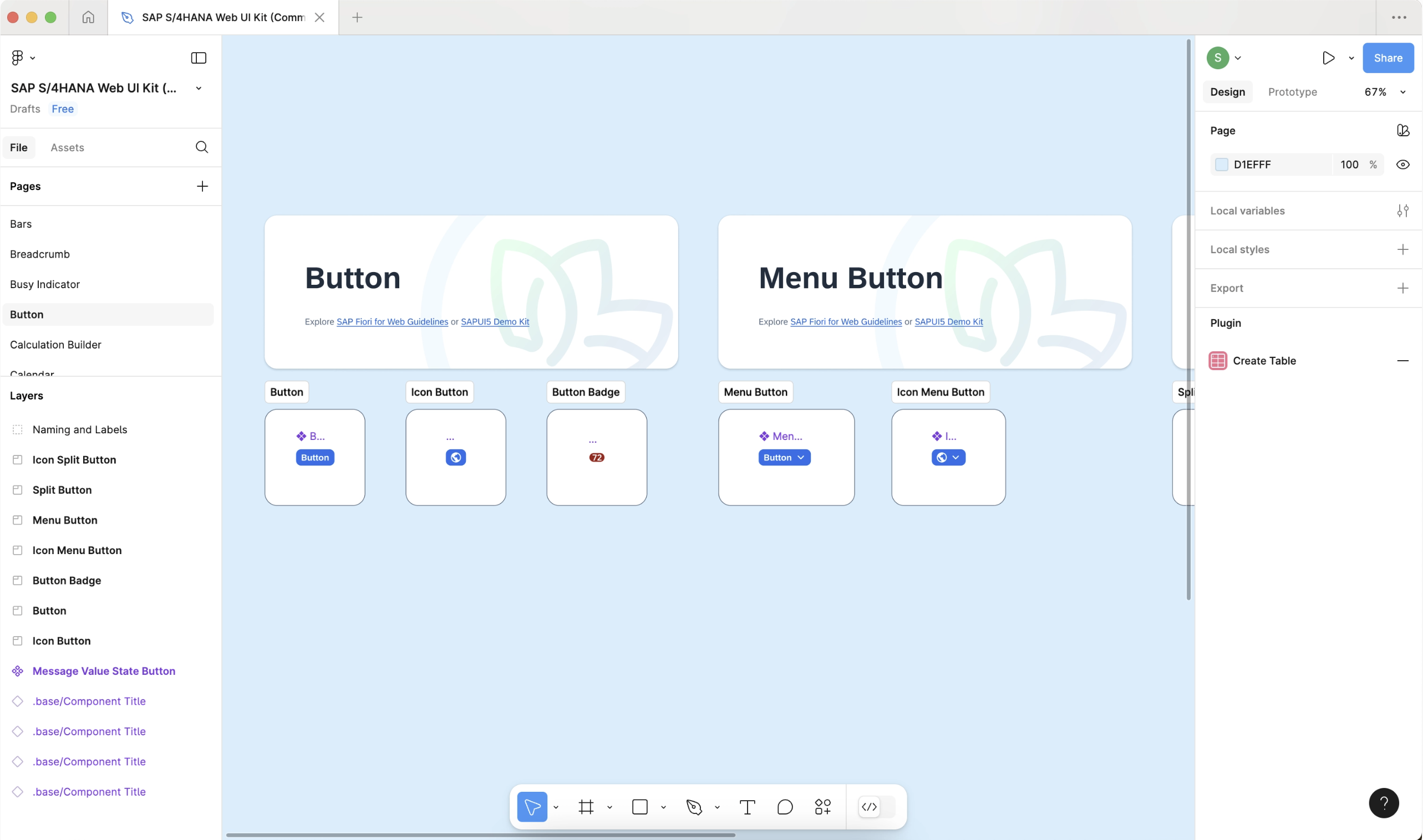
Libraries can be loaded within Figma to use templates such as specific components, interaction patterns and layouts. SAP also offers its own library with a large selection of UI components.
An important starting point for the design of user interfaces in the SAP environment is the Fiori UI kit. This contains the aforementioned Figma library with its own templates for components, layouts and interaction patterns. The kit also includes the SAP standard font “72” and the SAP icon set in the Horizon theme.
Advantages and disadvantages of the SAP UI kit
The SAP Fiori Web UI Kit (short form: SAP UI Kit) offers a number of advantages that make the design process easier. One advantage is the prefabricated components. These are control elements such as buttons, selection fields, form fields and so on. With the SAP Fiori Web UI kit in Figma, you don't start from scratch: templates such as components, buttons, dropdowns and layout templates are immediately available for prototyping. This saves time and ensures that the design meets Fiori standards right from the start.
All components and layouts are aligned with the SAP Fiori Design Guidelines. This makes it easier to remain design-compliant so that implementation can start immediately after handover to the developers.
If required, colors, fonts and other elements can be adapted to your own corporate design.
Not all Fiori UI components are included in the kit. If certain elements are missing, alternatives must be used or these must be created and adapted yourself. In addition, not all components are dynamic and can be used directly for interactive prototypes, which is why adjustments are occasionally necessary. However, the settings of the components improve with each new version of the SAP UI kit.
Conception and design of the visitor registration
Before we get to the design of the user interface for visitor registration, I would first like to explain what is meant by a so-called UI Integration Card in the SAP environment, which tools are required and what the conceptual idea of the registration process is.
What exactly is a UI Integration Card?
UI Integration Cards offer a way to display application content compactly on a card and integrate it into SAP environments such as SAP Work Zone. The content can be data from SAP systems (e.g. SAP S/4HANA) or other sources. The abbreviation UI in “UI Integration Cards” stands for User Interface; in short form, the word integration is also omitted and only UI Cards are used.
UI cards can be used for various use cases, such as the display of KPIs, status information, call-for-action to initiate processes such as visitor registration. Examples of UI cards can be found in SAP's Card Explorer:
https://ui5.sap.com/test-resources/sap/ui/integration/demokit/cardExplorer/index.html
What resources do I need to start designing the UI card?
Figma Downloads
SAP Design Resources
What is the conceptual idea behind the UI card for visitor registration?
I would like to divide the visitor registration process on the card into several steps. The multi-stage process in the card ensures clear, focused user guidance and enables better checking of entries and prevents the card from appearing overloaded with too much information.
The card starts with an overview of all recently logged-in visitors and their respective status. The multi-stage process for visitor registration can also be started from here.
After successful completion, a confirmation appears that the registration has been successfully received and the user returns to the overview.
Design: Overview of visitor reports
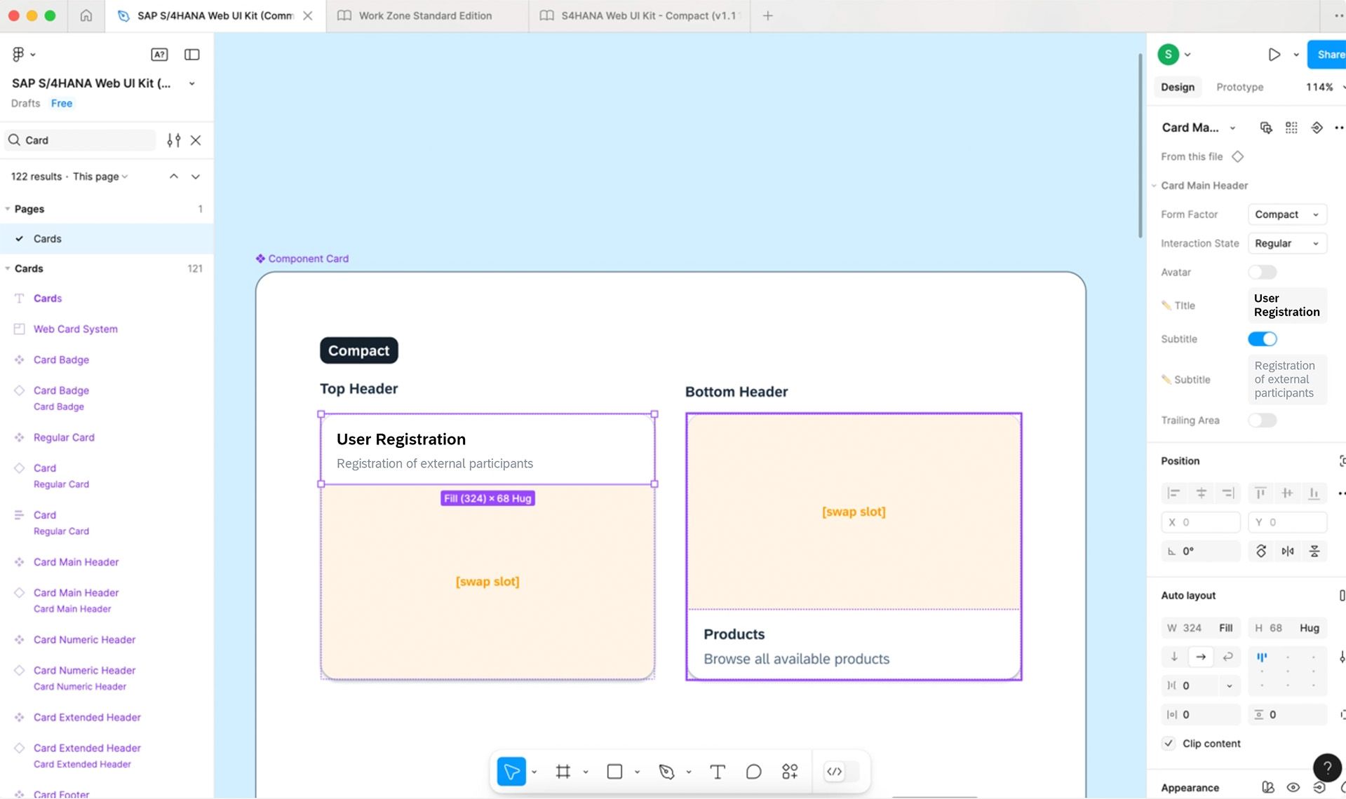
The “Card” element from the SAP UI kit serves as the basis for the UI card. The appearance can be dynamically adapted via the properties of the card component. I add a suitable title and subtitle.
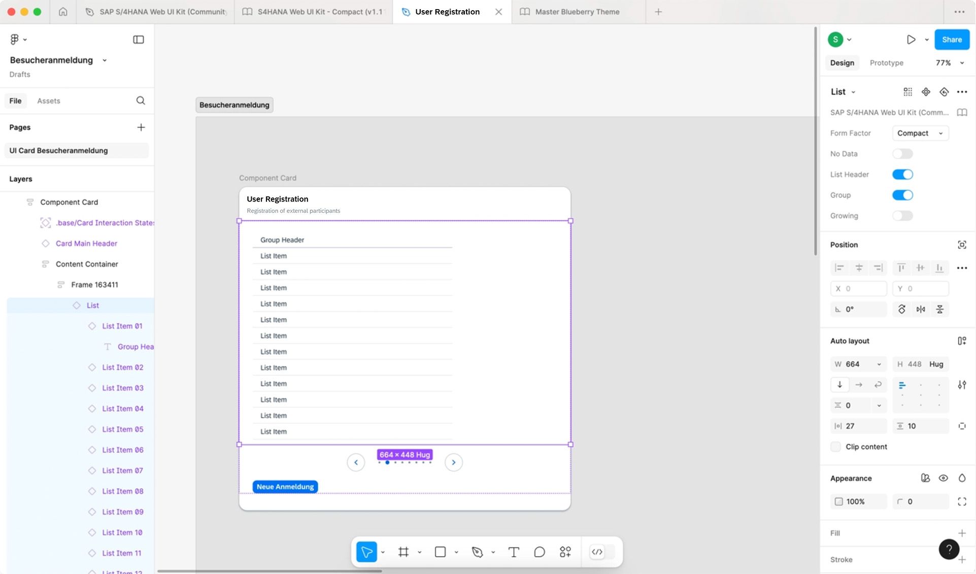
We also add further elements, such as a “List” (list element), a Carousel Page Indicator (navigation element for browsing) and a button to start the registration process.

Design: Customize appearance
The design of the added elements can be flexibly adapted, including the colors. For the visitor registration card, I customized the color scheme according to my own ideas. However, it is of course also possible to adapt it to the company's corporate design.
Not only colors, but also font styles, outlines, spacing and many other design aspects can be adapted. Colors and fonts can be saved as variables so that they can be reused.

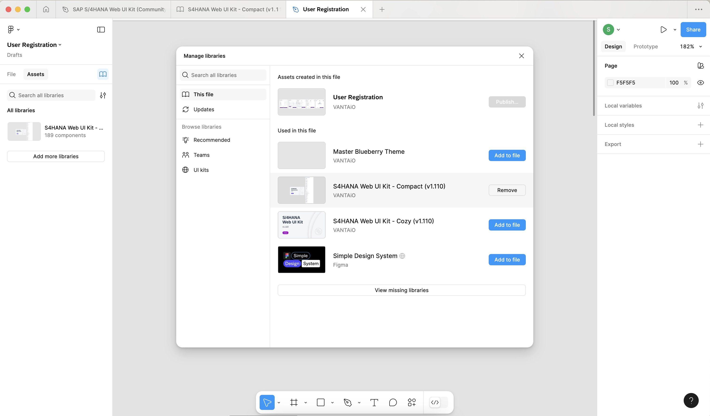
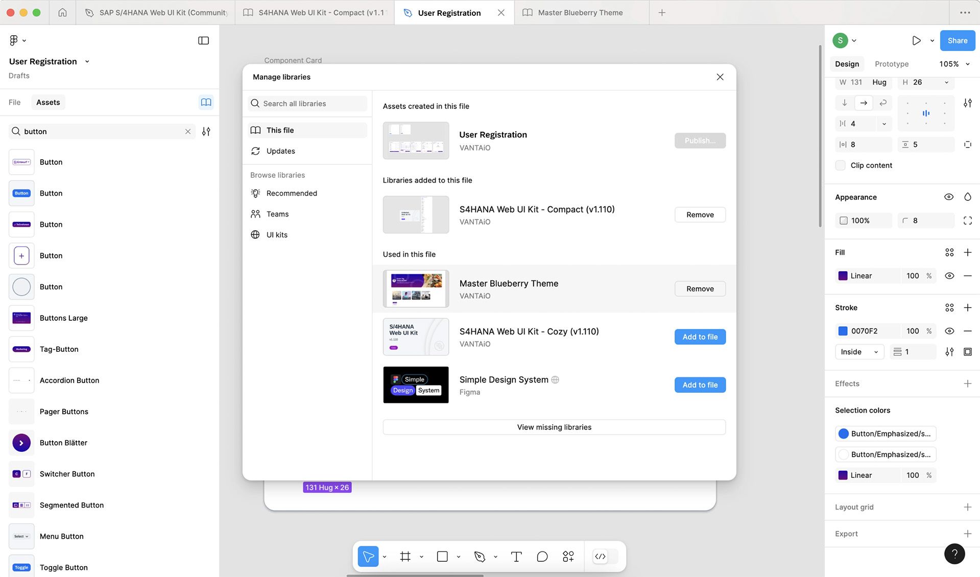
We have developed our own “Blueberry Theme” library for our VANTAiO demo system landscape, which is based on the SAP UI kit. This allows us to create a consistent and appealing user experience with a modern look and feel.
At this point, I integrate the “Blueberry Theme” into the file in which I also create and edit the visitor registration and use it as a library for the further design of the card.
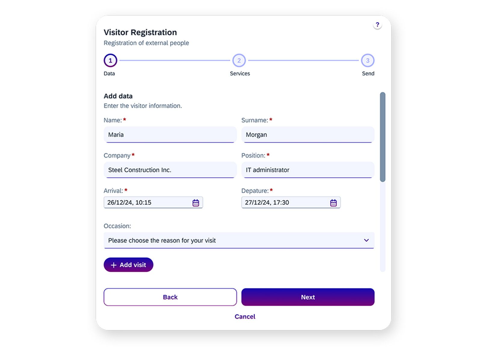
Design: Step 1 - Record visitor data
We need various input fields for data entry, which are provided by the SAP UI kit:
Text Input Field
Input field for text entries
Select / Combobox
Selection menu for the occasion
Date Time Picker
For the selection of arrival and departure date
Pflichtfelder
Are simply marked with the property “Required”.
Buttons
Support navigation in the form by allowing the user to jump back and forth between steps or cancel the process.
If mandatory fields have not yet been completed, the user should not be able to continue with the form. The “Back” and “Cancel” buttons remain active, while the “Next” button is deactivated and grayed out. This is easy to implement with the UI kit. The button element from our library, which is based on the SAP UI kit, offers various statuses. In this case, we select “disabled” for the deactivated state in order to visually gray out the button.
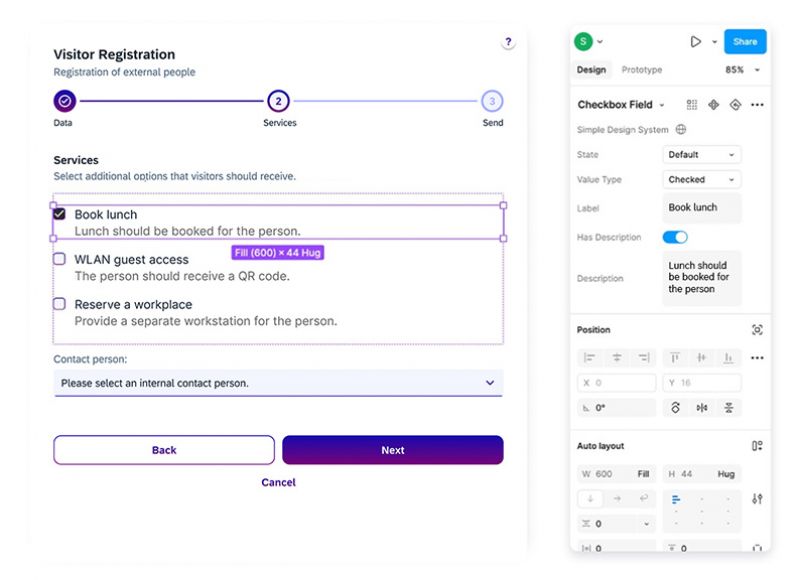
Design: Step 2 - Select service
Visitor registration should be available as a self-service in the company. Intuitive operation is therefore essential.
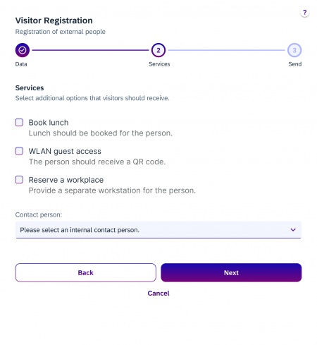
To record the services, we need the following different input fields to make user interaction efficient and intuitive:
Check Box Field
to enable multiple selection of different services
Select / Combobox
a selection menu for choosing the contact person
Buttons
Support navigation in the form by allowing the user to jump back and forth between steps or cancel the process
These input fields clearly structure the process and improve user guidance.
Design: Step 3 - Check entries and send
In the last step of the multi-stage form, the entries should be summarized to give the user the opportunity to revise them again. If the entries are correct, the data can be sent.
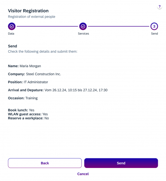
The following components were used to present the summary:
Simple text fields
for the display of text
Buttons
to navigate or send the form
Design: Confirmation message
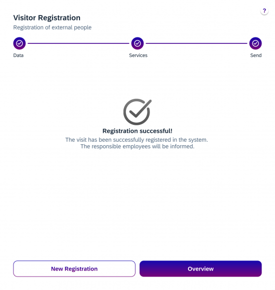
It is important that the user receives feedback as to whether the data has been successfully transmitted so that uncertainties and multiple entries are avoided.
The workflow for registering further visitors can be continued from here.
With the “To overview” button, the user is offered an exit point and can return to the overview.
Conclusion
The SAP Fiori Web UI kit in Figma provides a good basis for the development of UX/UI designs. It enables:
- Efficient prototyping: prefabricated components and layouts save time.
- Flexible design: designs can be adapted to your own corporate design.
- Efficient collaboration: Developers can implement the designs directly, as Fiori conformity is taken into account from the outset.
The example of the visitor registration card shows how new processes can be quickly and easily visualized and intuitively designed using tools such as Figma, the SAP Fiori Web UI kit and a basic, custom theme such as the “Blueberry Theme”.
Once the concept has been finalized, the development team has a very good basis for their work on implementing the actual application. You can find out more about implementing visitor registration as an app in Part 2 of this blog series: From the idea to the finished SAP Fiori app (Part 2: Development).
I hope this article has inspired you to try out the SAP Fiori Web UI Kit in your projects. I wish you lots of fun with it!
Do you have any questions?
Please feel free to contact me.
Do you have any questions about this blog entry or about working with the SAP UI kit in Figma? I will be happy to answer your questions personally.

Susanna Nathan
UX & Design Consultant
T +49 6131 – 622280


